Why the hype around infographics?
In 2013, SlideShare highlighted two notable points about infographics:
- People like infographics 4 times more than presentations, and 23 times more than documents on SlideShare.
- Users share infographics twice as often as presentations, and 3 times more than documents on other social networks like LinkedIn, Twitter or Facebook.
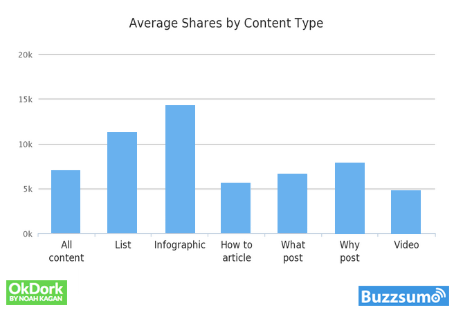
Fast forward to the latter half of 2017, and the trend continues. BuzzSumo and OkDork researched online users’ content consumption and sharing patterns by analyzing 100 million articles, concluding that people are more inclined to share lists and infographics.
Everyone is exposed to a ton of information on a daily basis. However, in the modern state of information oversaturation and decreasing attention span, well-presented information is the key to retain the audience.
Infographics are the perfect way to explain even the most complex ideas in a simple and visually engaging manner. Since humans can process visual information faster than text, it makes complete sense. According to NeoMam Studios, a marketing agency, “We are all visually wired!”

According to another study by Unbounce, the annual increase in infographics related searches on google exceeds 800%. Hence, companies are rolling out, even more, infographics in response to this trend.
For this reason, it’s no surprise that SEO professionals and social media marketers are emphasizing high-quality infographics to their clients. As a content writer and surgery professor who loves to explain elaborate points quickly, I extensively use infographics in my writings and projects. I’ll use this opportunity to share my experience and suggestions.
So, without further ado, let’s dive in.
4 Steps for Stunning & Shareable Infographics
1. Research and structure your ideas thoroughly

Before you begin creating your content, consider the following:
- What are some relevant problems people are facing?
- What are some practical solutions, and how can they be communicated?
How to gather information for your infographics?
Carry out keyword analysis:
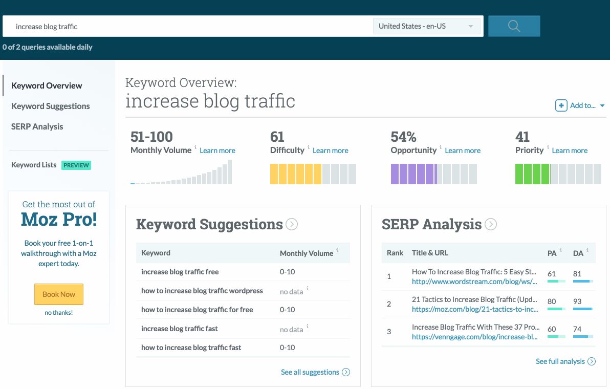
As we discussed earlier, you need to provide easy solutions to your readers’ queries. A keyword analysis helps you know which topics are the most relevant. For your infographic, consider the following steps and resources:
In your web browser, open any one of three popular keyword research tools: Moz, Ahref, or SEMrush. The search results will help in providing more relevant data in the infographic.
Use online trending directories:
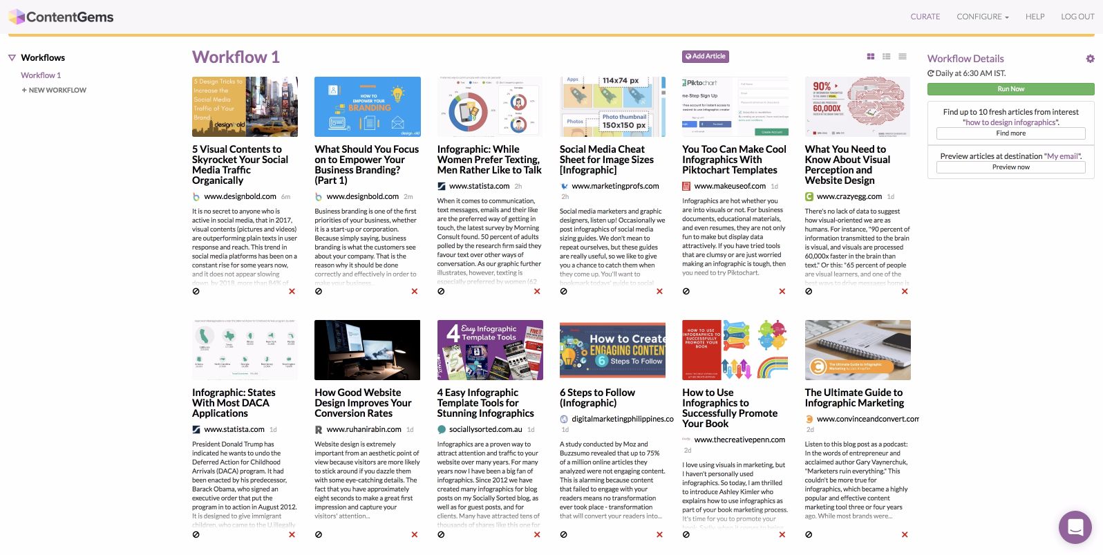
One of the easiest ways to gather more material for your infographics is to read trending or popular articles. Use online trending list directories like BuzzSumo or ContentGems. To research for the current blog post, I searched for popular articles on “Infographic designs” at ContentGems. These tools immediately display a grid of trending articles on infographics in the past 24 hours. If your website and social media platforms have a decent following, you can ask for input directly from your users. Surveys are another option to use an existing readers base.
Create a consistent structure:
After ensuring proper research, the next critical step is to organize and structure your ideas properly. A well-planned approach will increase your chances of creating and delivering a coherent message to your target audience.
Analyze all the collected material, remove extraneous data and information, and arrange each part to flow from the problem to its solution.
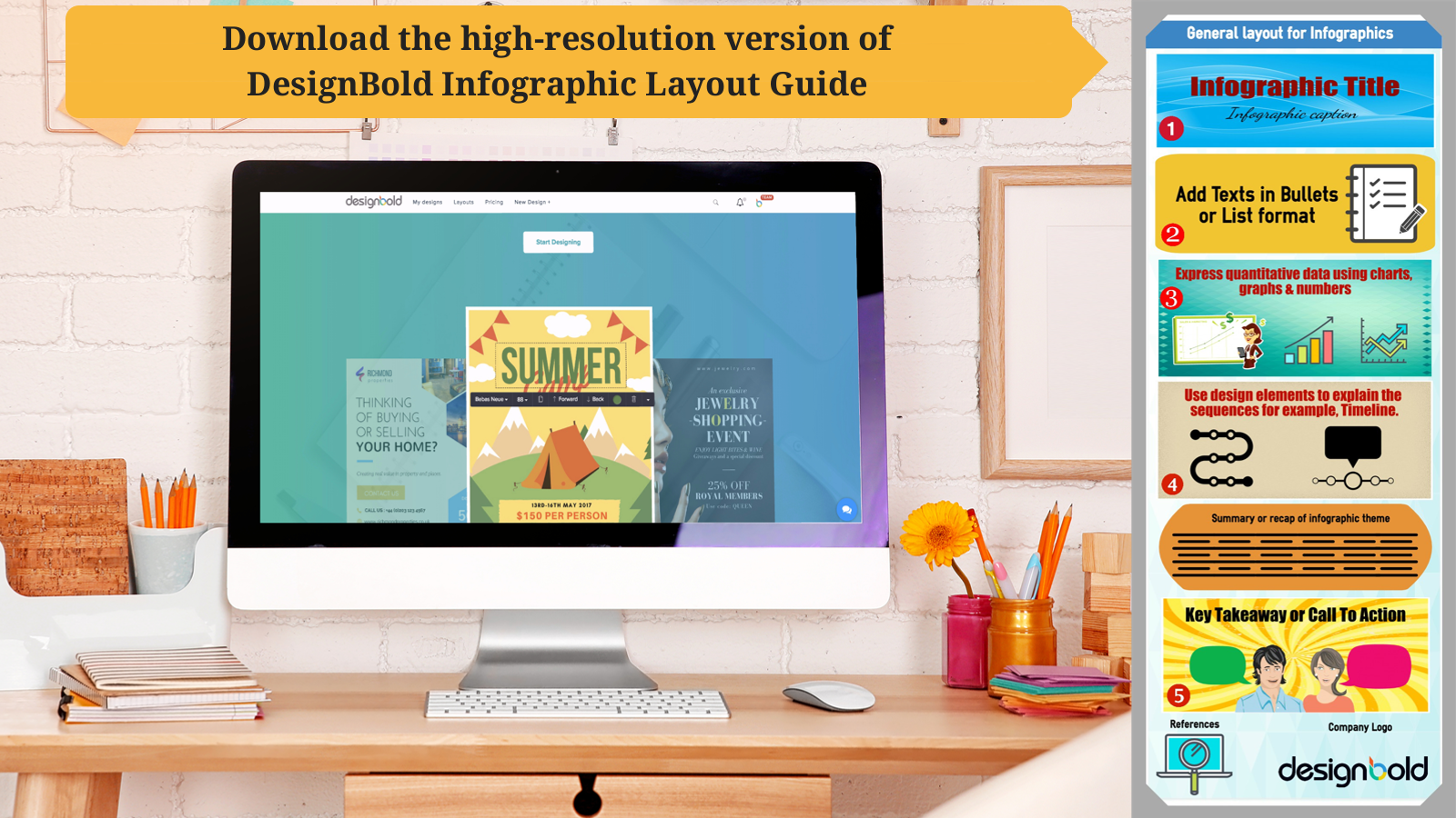
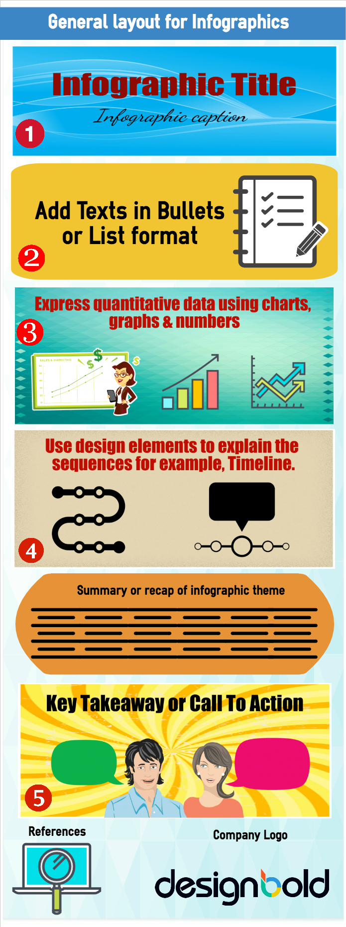
There is no fixed rule for an ideal infographic sequence, but Lab42 provides a typical, standard course: workable model for infographics.
Standard sequence for infographics:
- Header or Title: The most critical section in an infographic. The header will shape your audience’s first impression. Keep the title short and ensure it grabs attention.
- Subtitle or caption: It acts as the hook after the title. A good caption is one that pulls the reader in to learn more. Thus, it should be distinct but complementary to the main title.
- Text: The body of the infographic, and bulk of the information and data. Enter the relevant text in bullet point format, and avoid long paragraphs.
- Graphs and charts: Use graphs, charts, vectors and icons to explain the ideas more interactively.
- Timeline: You can also use timeline models in your infographic to explain major events.
- Summary: Recap of the key points.
- Key takeaway or call to action: This section offers an incentive or prompts the audience to take the desired action.
- Sources: If your infographic uses quantitative data, mention the relevant sources here for credibility.
- Company logo: Add your logo at the end to minimize plagiarism and boost brand recognition.
Below is a graphic overview of these key points.
2. Managing color palettes and fonts

Optimizing colors in your infographic
When it comes to visual marketing, colors play a decisive role. Color psychology has been demonstrated to influence user perception and behavior. Therefore, it is a serious matter to optimizing the colors for your infographics.
Managing the color palette for your infographic is confusing, as the choice of colors is subjective by nature. The best approach is to keep it straightforward and easy to read.
It has been shown that each primary color evokes a particular emotion. You can consider this and decide on a color reflecting the mood or theme of your infographic. Every color has a message, and using a suitable color palette can incite a positive response in consumers.

However, this isn’t the only point to consider. While going for a color combination, you need to take into account the surrounding design elements, including other text.
Pro Tip: Ask yourself these questions when choosing a color palette.
- Are the text, charts, and other content immediately identifiable?
- Is there excessive clutter, or is there sufficient empty space?
See one of our previous posts to help with addressing these issues: tools to help select the color palette. At DesignBold, we conducted a short social media research project on how brands around the world are optimizing their colors in infographics.
Optimizing fonts in your infographic

With thousands of fonts to choose from, it could be overwhelming to select the most efficient one for your infographic. So how can you decide the best typography for your infographics? Here are a few quick guidelines to follow.
Do not complicate your font selection. Stick to primary fonts.
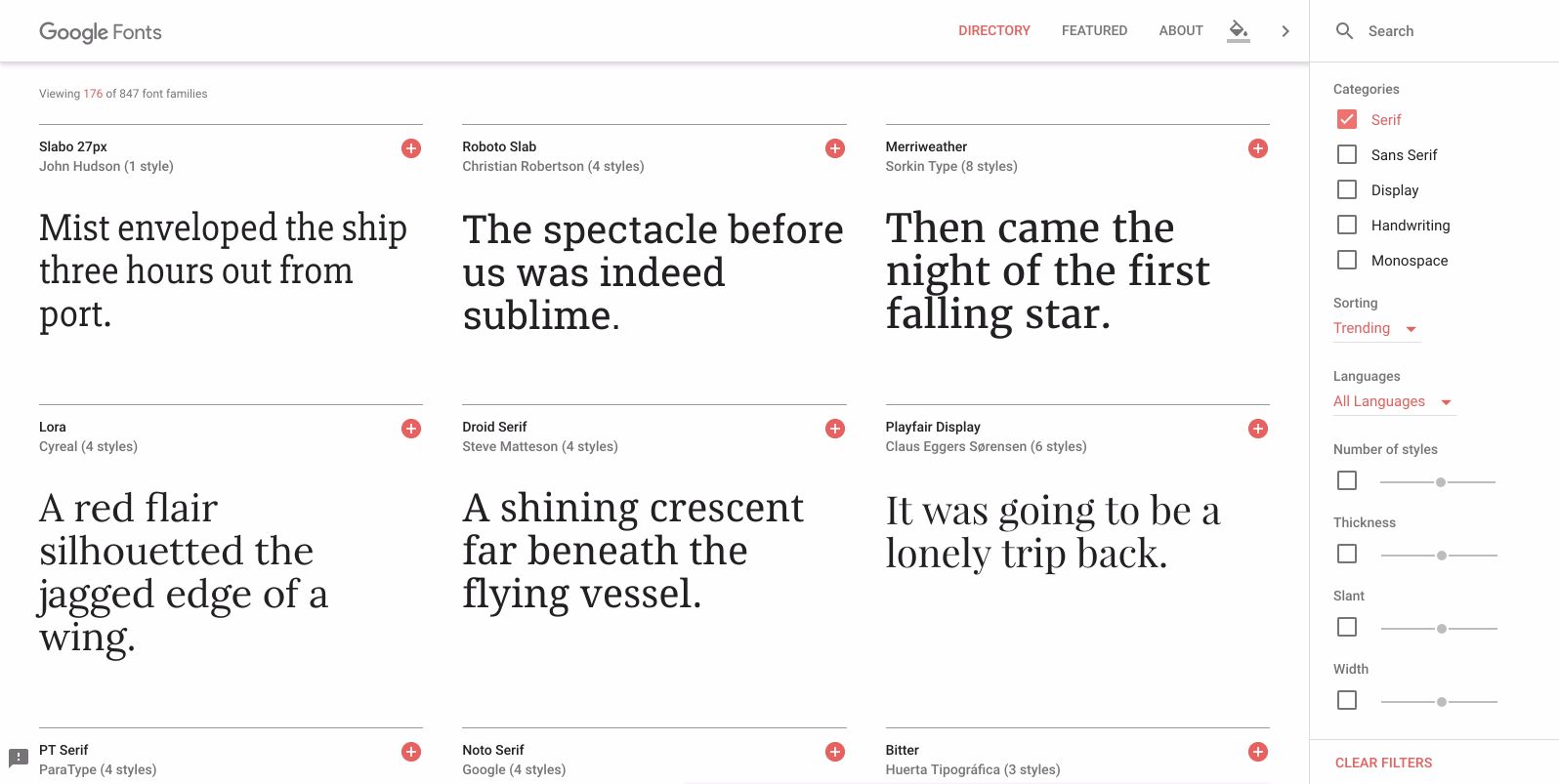
- Do not go hunting for fonts. Stick with the following font types: Sans, Serif, and Display.
- Serif Fonts: Most common in body text, due to legibility. The most popular serif font is Times New Roman.
- Sans Serif: Usually best for section headers, captions, lists, and titles. Favorite fonts in this family include Helvetica, Lato, and Arial.
- Display Fonts: More decorative in style. It can be used to express unique points or messages.
Match the fonts to your infographic’s theme
- Use fonts, matching the topic of your infographic. For example, if you are making an infographic on famous rock artists, use a display or designer font. When creating an infographic for academic purposes, use clear, legible fonts like Times Roman.
A free resource for fonts to use in your designs: Google Fonts: Collection of fonts curated by Google.
 3. Visual research and inspiration

Even if you’re hiring a professional graphic designer, this internal process will assist you in accurately conveying your ideas and goals. It will help the designer to create an infographic that is closer to what you want.
For additional ideas on your infographics design, consider the following sites – DailyInfographic, Dribble, Pinterest, and Behance. In each of these resources, you will find an extensive collection of infographics on various topics.
There is a thin line between inspiration and plagiarism. Infographics are intellectual property that may be protected by copyright. Violations can harm your brand image. Therefore, be careful how you adopt the ideas. As a simple reminder, do not copy and paste.
Ask yourself the following questions when browsing designs for your infographic.
- What made you like the design in the first place?
- What are the color palettes used in the infographic? Also, refer to this post.
- Is the design easy to read?
- Does it flow from question to answer?
- Can you make it unique, without plagiarism?
4. Creating your infographic
It’s now time to create the best possible infographic for your readers.
After hours spent on steps 1 to 3, you understand your infographic better than anyone else. So it makes sense to design it yourself. Moreover, there are several easy to use software to help.
Yes, there will be a short learning curve. But the tools we are listing are easy to master. To make it even easier, the online design platform DesignBold does not even require a learning phase!
Offline designing software:
There are many paid and free software for creating infographics, but I will only mention the ones I’ve personally used. Mac is my preferred device, so these programs will certainly work on them. Some of these programs also offer a Windows version.
- Belight Printworks: Mac only, paid product/service.
- Jumsoft Toolbox: Both Mac and Windows compatible, paid product/service. It comes as an add-on to MS Office (Windows) and Keynote/Pages (Mac).
You can also create original graphics much more quickly and also with a plethora of additional features by using DesignBold.
How can DesignBold help you to create compelling infographics for free?
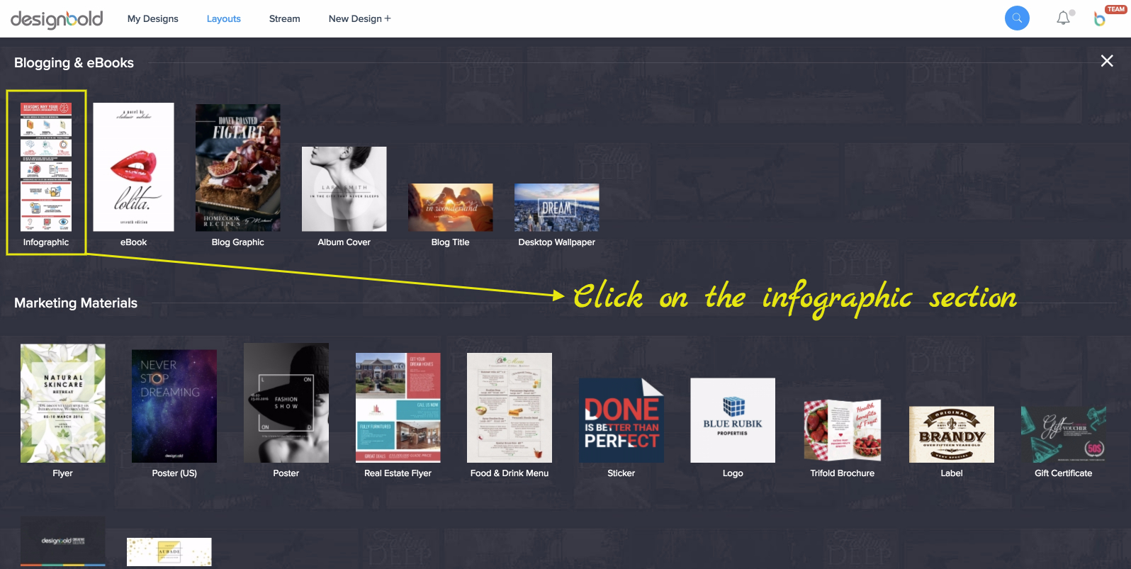
a) Visit DesignBold and click on the infographic section.
b) Select from one of the ready-made designs layouts.
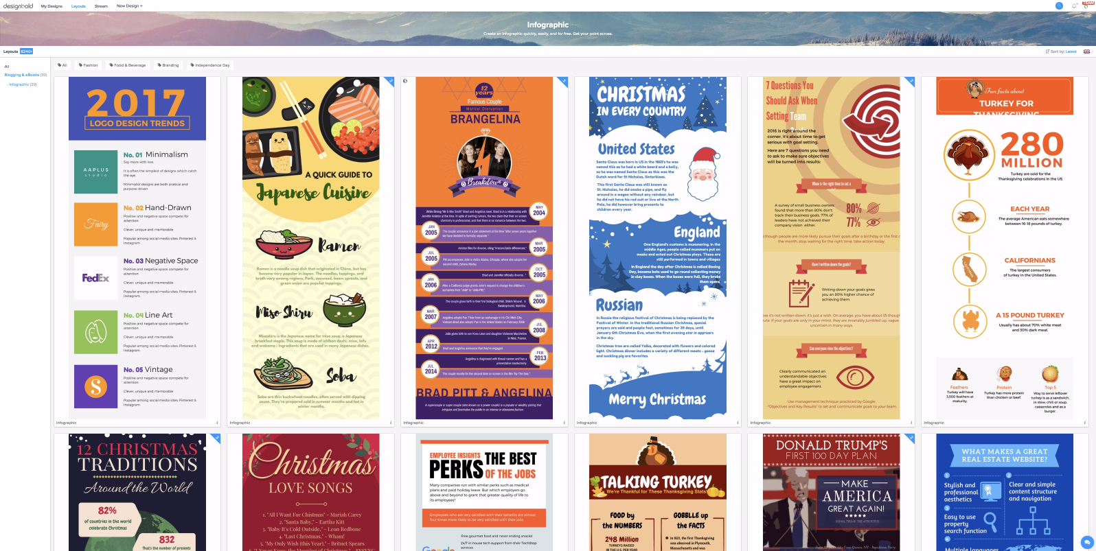
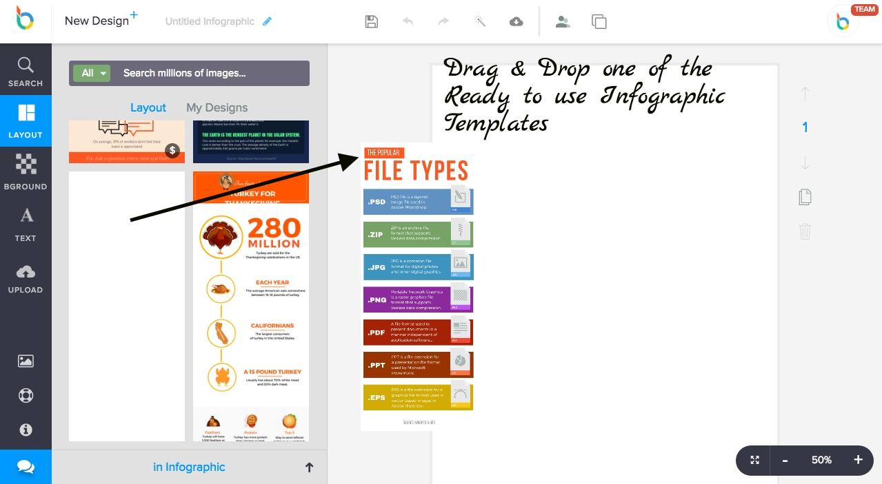
c) Select from one of the ready-made infographic layouts and “drag and drop” it in the designing area.
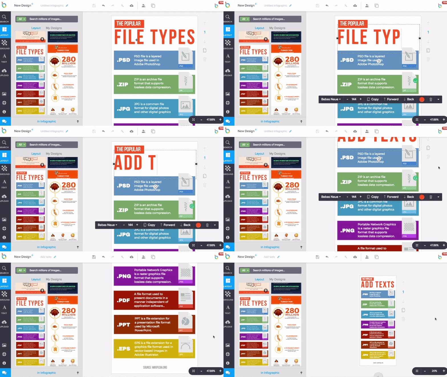
d) Edit/Add texts or vectors/icons/stock images to customize the infographic as per your requirement.
e) Download your infographic – Web version or HD Print version (Yay!)
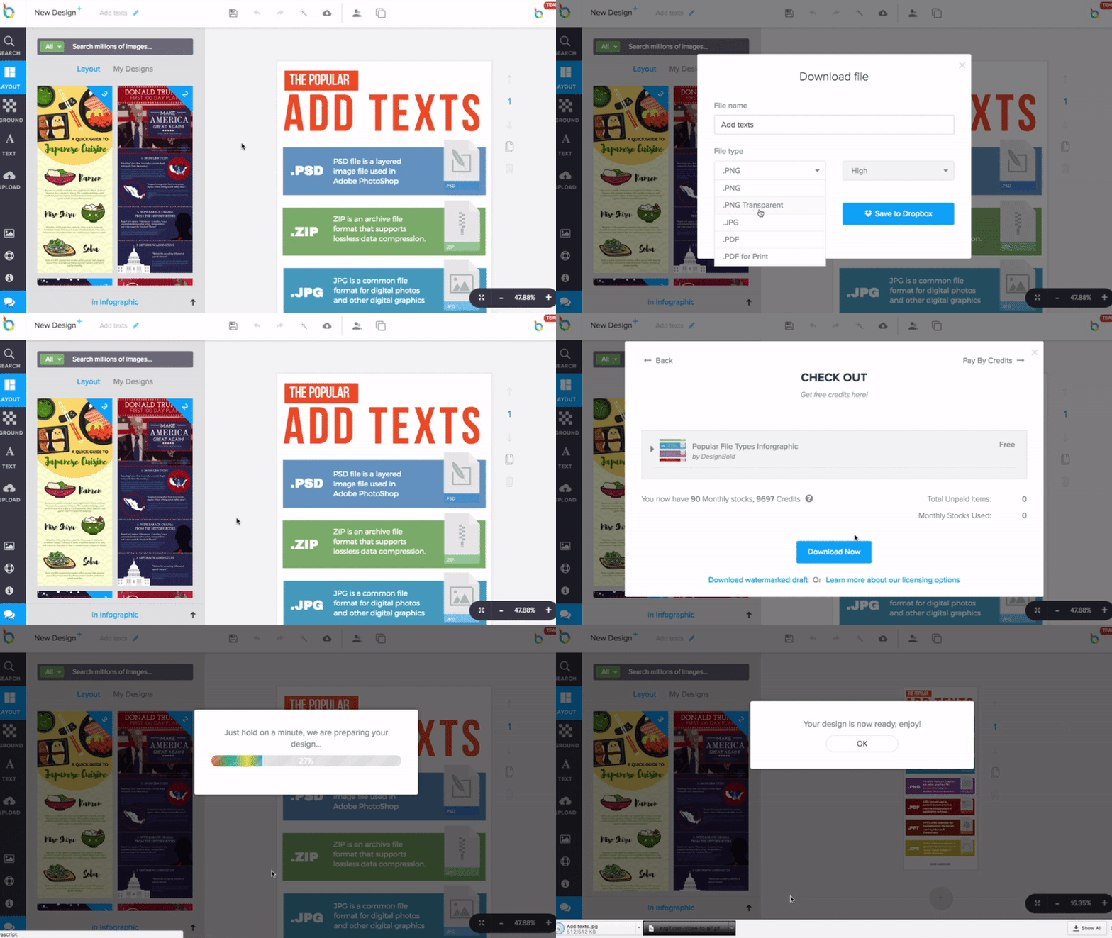
The entire designing process hardly takes few minutes, and you are ready with professional quality infographics for your brand.
Congratulations you are ready with your new infographic.
Promoting your infographic to expand its reach

Finally!
After so many tiring steps and many hours of hard work, you are ready with your infographic. You cannot wait to share it with your readers. Naturally, you have many expectations from it. You hope to gather substantial numbers of social shares and inbound traffic to your website.
It is a fact that infographics have the potential to go viral and in the process bring a significant amount of incoming traffic. But for that to happen you must have a well thought out promotional plan.
Here’s how to get started with your infographics promotion:
- Along with posting the infographic on your website, plan a publishing schedule for various social media platforms.
- Provide the option to your readers to embed the infographics on their blogs and social media platforms.
- Do not focus sharing only on the social media outlets which you manage or own. Connect with your fellow bloggers, entrepreneurs or influencers and pitch your infographics to them.
- Share the infographic with the influencers in your niche. You may not always get feedback, but you need to keep trying this method. In the meantime keep improving your infographics. Eventually, you will come across influencers who will share or use your materials. It will be worth the effort as it will bring incoming traffic and elevate your brand name.
- Distribute the infographic with all your email and mobile contacts.
- Add a prominent call to action on the infographic with your details so that prospective clients can contact you. (See the infographic layout scheme in the initial part of this post)
- Share your infographics on all the major documents and slide sharing sites like docstoc.com, slideshare.com, scribd.com, and Pinterest for an extra traffic boost and inbound links.
- Contact the bloggers in your niche and let them use the infographic in their posts with a link back to your website.
- Activate sharing option for your infographic (by using image sharers) and if people like it then they would love to share it with their peers.
- You may allow your readers to download a high-resolution version of your infographic in return for email or social share. This way when they use your infographic in their presentations your brand name will be focused.
- If you want to distribute your infographic further, then check out this elaborate list of more than 100 submission sites to share your infographics.
Conclusion:
Congrats! The infographic design for your marketing campaign is finally ready. So, what are you waiting for?
It is time to start designing more professional quality infographics of your own. For convenience, time and quality, keep DesignBold in mind. It can be a valuable tool from start to finish.
To kickstart your infographics creation, we have curated a collection of professional design templates.
Free infographic design templates:
DesignBold infographic templates (user registration optional)
